
This is a true story. One of my classmates treated me in exchange for allowing him to copy from my exam paper. I am grateful he considered me superior in our studies. During the exam, seated right behind me, he signaled halfway through to see my paper. I complied, feeling guilty about the ‘bribe’. He was furious upon seeing my answers. “Bloody fellow, you’ll fail. Stop drawing pictures and write something,” he whispered venomously. My answers were all in diagrams, flowcharts, tables, and infographics, which baffled him, making them hard to copy. Nevertheless, I passed with good marks!
“A single picture speaks a thousand words.” I am a visually oriented person. I strive to make my scientific presentations graphical and self-explanatory. I cannot stand it when others neglect the aesthetic quality of their slides, cramming them with text. While the scientific subject should not be overshadowed, poorly designed slides can completely disengage the audience.
“Don’t judge a book by its cover,” we’re told as children. Yet we do, because we live in a visual culture where first impressions are instant. They are key, shaping our perception of people, places, products, experiences, and designs. Based on these impressions, we make judgments. Is that so terrible?
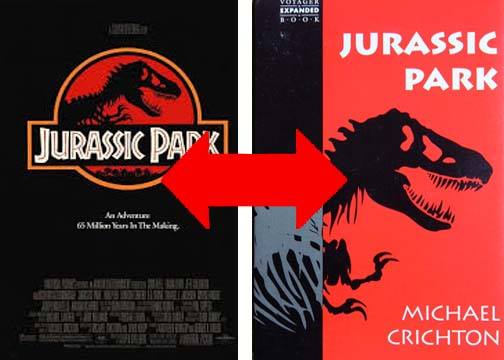
“I’ve found that the two most effective and fascinating aspects of first impressions—both the ones I create and encounter—are clarity and mystery,” says Chip Kidd, a renowned designer with over thirty years of experience. Chip Kidd, a graphic designer and writer based in New York City, has designed covers for numerous bestsellers. Remember the iconic “Jurassic Park” novel cover? That was Kidd’s creation, later adapted for the blockbuster film.
Kidd is a National Design Award recipient, an honor from the Smithsonian Institute’s Cooper-Hewitt Design Museum, which is a pinnacle achievement for graphic designers.
His book “Judge This,” curated by TED Books, complements his engaging TED Talk—”Designing books is no laughing matter. Ok, it is.” This book, part of a pricey TED set I purchased on Amazon, explores the balance between clarity and mystery in design. Design rests on a spectrum, requiring varying degrees of each. Kidd deciphers design choices, revealing how much of our world can be an enchanting magic show, a seductive work of art, and a sublime experience—if we know how to evaluate it.
Kidd suggests being clear when immediate understanding is essential and mysterious when capturing and sustaining attention. For book covers, he aims for an instant connection or enough intrigue to prompt further investigation—and a purchase.

In summary, Kidd advocates for creating visuals that transcend language barriers. He introduces a ‘Mystery-o-meter,’ a scale from clarity (1) to mystery (10), applied to the visuals in his book.
For those who value design and detail, this concise 125-page A5-sized book has become a “Bible of Designing.” It’s a compelling read for anyone interested in graphic design and aesthetics. The book’s takeaway message is that solutions to problems often emerge from understanding the problems themselves.
Prof. Dr. Prahlada N.B.
9 March 2019
Chitradurga”


Leave a reply